Do you believe in love at first sight?
I do. And even if you’re not sure, I think we can agree that first impressions make a big difference. We have around seven seconds before we solidify our first impressions of any person. For images and websites, however, it’s in as quick as 50 milliseconds. Now, that’s fast!
If something looks good, we’re going to pay attention to it. This is especially true for data. A recent study found that visual data is the best way to combat misinformation on the internet.
“Where numbers are concerned, a good chart has the power to change hearts and minds above and beyond what a paragraph of text can do.”
— Christopher Ingraham in the Washington Post
Making a graphic is one thing, but making it look good is a whole other ball game. So, let’s look at some industry secrets to making good-looking data that will have your audience swiping right in no time.
What does good data look like?
There are some golden rules in creating good data visuals.
Comic Sans, Papyrus, and Microsoft Word clip art, for example, all belong in the restricted section of the Hogwarts library. (In fact, I’m pretty sure Microsoft Paint is a Horcrux, but let’s not get into it.)
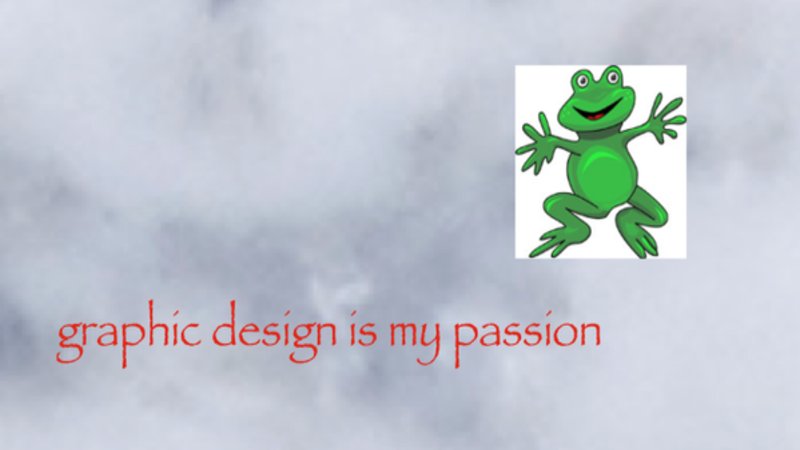
The above image is an example of what not to do. Please no.
Design Principles
Design principles are not well-kept secrets; a quick internet search will reveal copious blogs and tutorials on how to become a better designer. But as super busy student affairs professionals, you probably won’t have time to sort through it all. So, I’ve pulled together my top tips that I think will help you and your students.
A quick disclaimer, though: As with pretty much anything in life, and especially within creative industries, rules are meant to be broken.
Yet, rule-breaking is best left to the professionals. So, although you might occasionally spot beautiful graphics that don’t follow these guidelines, these are the fundamental principles that will elevate the quality of your work and get people to pay more attention to it. If and when you break the rules, do so with intent and caution.
Color Schemes
Pick two colors and stick to them
Always aim for around two main colors. Any more than two and you’re inching toward murky waters.
Imagery that looks busy can be distracting and pull focus away from the most important information. However, black and white are not included as colors for this rule, so feel free to use them to your heart’s content.
Use different tints, tones, and shades
Using only two colors does not mean your image has to be boring. Use a color scheme generator (like Colors.co, Color.Adobe, and Palleton) to find complementary tints, shades, and tones. You can then use vivid colors to emphasize important information and use the more subdued colors for secondary information.
Use gradients for backgrounds
Instead of a solid color background, consider using a gradient.
Gradients don’t have to have stark contrasts; they can be the same color, with a lighter tint at one end or a brighter circle in the center like a spotlight, AKA a radial gradient. A great resource for pre-made gradients is UI Gradients.
Use colors that match the industry and evoke a feeling
Colors play a huge role in capturing emotions. They can also communicate information to us, like how traffic lights and faucets use red to represent danger. Numerous studies have been conducted to try to understand what specific emotions colors evoke.
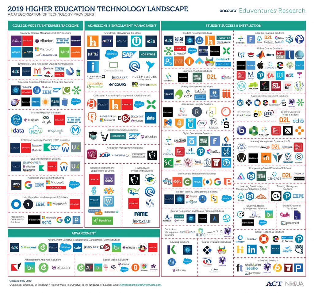
Additionally, companies and individuals within the same field often use same color industry-wide. For higher education, it’s blue. Here’s a graphic from Encoura of the educational techology landscape. Notice all that blue?
Source: Encoura
Use colors to tell a story
Color can help you communicate a story without text, which is especially helpful for infographics.
For example, if you’re presenting a report on two student organizations, you could assign a color to each org. Or, if you were showing a progression of students along a metaphorical pathway (such as toward learning outcomes), you could use colors to indicate the progression with red turning into green.
Fonts
Picking the right combination of fonts is tricky. A lot of it comes down to instinct and will depend on the structure and emotion of the image. But here are some general rules.
Find your personality font
We all want to find a font that stands out. That’s why Comic Sans, Papyrus, and Lobster became so popular. The trick is to not overuse what’s already been done.
If your image has a theme (such as retro, futuristic, or Halloween) you’ll want to find a typeface that fits it. This is called your personality font or display font. You want to use it sparingly — only for your most important information, like the title of an event, rather its location.
Some great places to find fonts, including many free ones, are Dafont, Google Fonts, and Adobe Fonts.
Mix font weights
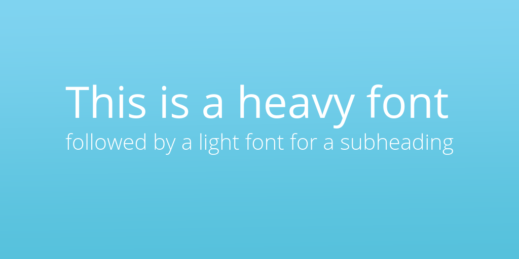
A really easy way to emphasize important information is to combine a few different font weights, such as light, regular, bold, and extra bold.
Put the most important information in the bigger, bolder font. Then, follow up with a lighter font beneath or above.
Limit the number of fonts
Unlike with color, there’s no official rule regarding how many fonts are too many, but generally, you shouldn’t use more than three or four. Too many can become confusing and busy. It will look less professional, and people will pay less attention to it.
Mix a serif and sans serif
There are two main categories of fonts: Serif and san-serif. Serif fonts have additional lines or strokes at the end of each letter.
Take a look at the edges of the letters in the image below. A sans-serif doesn’t have any additional strokes. Script and cursive fonts are almost always serif fonts.

Image Source: Planetary.org
Don’t be afraid to mix these two types of fonts. They can be very complementary.
Don’t default to a drop shadow behind text
One of my personal pet peeves is when designers use drop shadows behind text to try to provide contrast over an image.

If you want an image to sit behind text, that’s totally cool. But try to place text on clean, open space — such as a cloudless sky, rather than a busy brick wall.
Another way to create contrast (without using a drop shadow) is to turn the brightness and/or contrast down on the image so that white text shows up better. You could also place a solid box behind the text.
Composition
The composition of your image should depend on the type of image you’re making. A social media post will have different standards than an event flyer or an infographic.
However, there are some pointers that apply to every type of image.
Leading lines
Lines are a great way to help direct the viewer’s attention to what’s important. You can achieve this with other shapes, such as circles or, more obviously, arrows. Don’t be afraid to help guide your audience to where they should look!
The image below is a good example of how lines move your eyes from the most important information (the movie title), down to the less important information (the credits).

Image Source: Canva
Hierarchy
Creating a hierarchy within your image is vital for emphasizing the most important information — especially if people will only have a few moments to see it.
Think about how a traditional newspaper or online blog has a large headline, followed by a bold subheader, followed by smaller text for the bulk of the story. The same goes for your designs; the name or purpose of an event are highly important, so they should go at the top of the hierarchy. Things that aren’t quite as important, like the location and time of the event, can be emphasized less in terms of size and position.
Balance
“Balance is not something you find. It’s something you create.”
— Jana Kingsford
Creating balance in your designs comes down to symmetry. In order to do this, think about each element in your image as having a weight that needs to be balanced.
Wherever you have blocks of text, textures, or differently-sized shapes, make sure there’s a similar object on the other side of the image. (You can also achieve asymmetrical balance, but that is a lesson for another day.)
A quick way to check your image’s symmetry is to squint slightly while viewing it. It’ll help you see past the detail and focus just on the outlines of shapes.
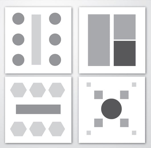
Image source: Jayce-O-Yesta
Space to breathe
Cramming too much information into a small space is an easy way to overwhelm and then lose your potential audience. Our brains like a bit of empty space; it helps us better process content, especially if we’re viewing it online.
So, allow for a margin around the edge of your image. It doesn’t need to be blank, just avoid putting your text right up against the sides. The same principle applies between lines of text (leading) and between letters (kerning).
Free Design Tools
There are a ton of online resources out there, but here are some of the easiest and most popular ones.
Canva
I guarantee you that on any given day, you see at least 10 images on social media that were designed using Canva. No one should use Microsoft Word, Publisher, or MS Paint to create images when Canva exists.
One word of caution: Canva has many wonderful templates which provide great inspiration, but if you want to use them, do so carefully. Anyone familiar with Canva’s template style will be able to spot a template, and it may make your designs look lazy.
If you want to use a template, try to customize it as much as you can to get an original design that looks and feels like your brand.
Adobe Spark
Adobe offers an image design tool called Spark. It’s generally helpful for online content, such as web and social media graphics. It’s free and is especially great for Adobe loyalists.
Piktochart
I discovered Piktochart while at a conference for non-profit marketing. This website is a great tool for making all types of images but especially infographics!
Figma
Figma is a more advanced tool for people who want to get collaborative with their designs. There’s a freemium version, but I only recommend it if you’re confident with advanced design tools.
Stock Graphics and Photos
We’re not always lucky enough to have the perfect imagery at our disposal when crafting our graphics. Fortunately, the internet has a solution for that! Take a look at the resources below for some free (or relatively cheap) graphics and photography.
Graphics
Freepik has a large resource library with tons of resources. Most are vectors, which are graphics that can be scaled to larger sizes without becoming pixelating or distorted.
The best part is: They’re free! The only requirement is that you need to credit the author by putting their name somewhere on the image.
Creative Market has a really wide range of media from talented freelance artists. You can typically pick up a pack of vector images for under $10. Creative Markets also offer free assets every Monday.
Stock Photos
For stock photography, I recommend Unsplash and Pexels. Both offer no-cost licenses for images and videos that don’t look like your stereotypical stock imagery.
If you do opt to use these, I recommend doing a few different searches for the content you’re looking for and not settling for the first image. Because these licenses don’t cost anything, many people will have used the first few images in your search results, and you’ll fall into the same laziness trap as with Canva templates.
Charts
At any given point, somewhere in the world, a student affairs professional is shuddering at the mere mention of Microsoft Excel.
So, instead of relying on the basic graphs you can make in these programs, take a look at these websites to raise the bar on your graph game.
Google Charts
Google has a free chart creation tool that comes with a library of free templates. It also allows users to create live dashboards for their websites.
Data Viz Catalogue
If you ever struggled to decide what type of chart to use, Data Viz can come to the rescue. It has a really clean, easy-to-use breakdown of charts that are categorized by purpose.
Canva
We’ve already recommended Canva in this blog but it deserves a second mention for its chart design tools.
Canva offers a whole slide deck category, which allows you to make custom mind maps, bar charts, and line graphs. All you need to do is pop in your values and you’re good to go!

And with that, you’re all set! Now it’s time to make some stunning graphics and impress everyone on campus (just so long as you stay out of that restricted section).
Let me know on Twitter @themoderncampus if you have a tip that I missed, an image you made that you’re super proud of, or examples of some graphic design nightmares!


